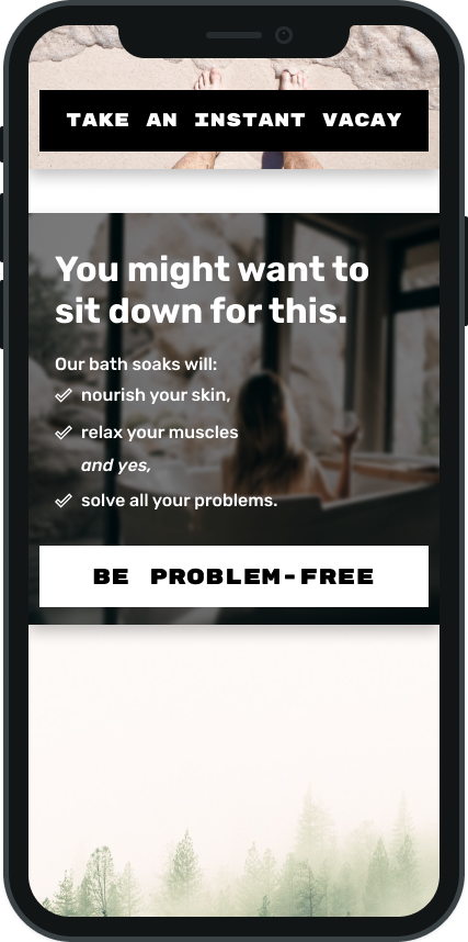
My first stab at creating a look for the company was a traditional spa vibe, with a medicinal-looking layout and extremely classy fonts. Some specific feedback was "meh." Not only has this vibe been done to death, but it hearkens to the days of marketing certain toiletries to certain genders. In more recent years, some companies had the epiphany that male, gender-fluid and non-binary consumers also enjoy cleanliness and nice-looking abodes. So why not keep this trend going with unique, inviting branding with broad appeal to all types of customers?
Creating a logo was much more streamlined. I knew it needed to stay simple but give the customer information about the company at a glance. The owner had chosen the company name as a nod to her maiden name (Day), so to keep things personal, I suggested we include her love of the beauty of her home state.
The owner was born in the 1950s here in Oregon and has never wanted to live anywhere else. Knowing that smell is closely linked with memories, we paired natural scents with many of her vivid Oregon experiences, naming each recipe for a popular locale around the state. Residents and visitors will be able to celebrate their own Oregon memories each time they use the products and simultaneously be reminded that they are supporting a small, local business.
The images and font were inspired by
vintage national park posters, much like ones the owner would have seen on her childhood trips, and I opted for a stark color palette of black, white and cobalt blue. This was to let the locations themselves grab all the glory, to give a nod to old-school blue medicine bottles, and so the brand would stand out from other natural toiletries competitors' neutral color palettes. Popping these unisex bad
boys people on some plain black, white and blue containers will be the perfect mid-mod gender-neutral decor.